Pseudo-classes and pseudo-elements
Pseudo-classes and pseudo-elements
What is a pseudo-class?
A pseudo-class is a selector that selects elements that are in a specific state
specific state
- the first child element of an element: first-child
- being hovered over by the mouse pointer: hover
给article下的第一个段落设置样式
使用class selector
<article>
	<p class="first">PPP</p>
</article>.first {
font-size: 120%;
font-weight: bold;
}如果有新的段落添加到了最前面,需要:
- 删除以前段落的class中的first;
- 给新添加的段落添加class="first"
需要一种class 不需要定义在具体的element内(作为element的attribute),而是和selector所匹配的element关联(根据selector匹配的element动态的添加class)
使用pseudo-class设置article的一个段落的样式:
article p:first-child {
	font-size: 120%;
	font-weight: bold;
}
What is a pseudo-element?
they act as if you had added a whole new HTML element into the markup, rather than applying a class to existing elements.
目的:select the first line of a paragraph
使用span 包围第一行的内容
    <p>
      <span
        >For example, if you wanted to select the first line of a paragraph </span
      >you could warp it in a span element and use an element selector;
    </p>
span {
color: red;
}效果: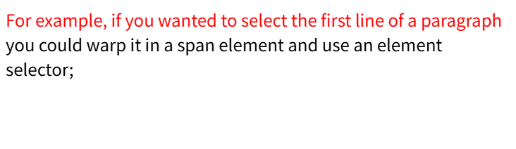
但是一但p的宽度发生变化,第一行的内容也会变化
需要一个特别的 span 能够表示 p 内的第一行
使用pseudo-element对p的第一行进行样式设置
    <p>
      For example, if you wanted to select the first line of a paragraph you
      could warp it in a span element and use an element selector;
</p>p::first-line {
color: red;
}相当于创建了一个element名称为first-line,它的内容是p的first-line
p first-line { color: red; }选择p的子元素first-line
效果: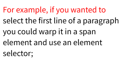

pseudo-class 和 pseudo-element 的区别
- pseudo-element:new element,可以是关联element的一部分
问:可以选择p内first-line,那是不是可以选择指定的行?第n行,最后一行。。。 - pseudo-class:和关联的element的状态 或 子element有关
可以选择first-child,最小的粒度就是element
注
Some early pseudo-elements used the single colon syntax.
Modern browsers support the early pseudo-elements with single or double-colon syntax for backwards compatibility.
Generating content with ::before and ::after
可以使用pseudo-element添加内容
<p class="box">Content in the box in my HTML page.</p>应用css前:
      p.box::after {
        content: "This should show after the other content";
        background-color: yellow;
      }
效果: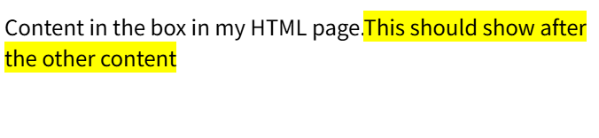
p.box::before { }效果:
添加其他内容:
      p.box::after {
        content: " ➥";
      }
效果:
      p.box::after {
        content: "box";
        display: block;
        width: 100px;
        height: 100px;
        background-color: greenyellow;
        border: 1px solid black;
      }
效果: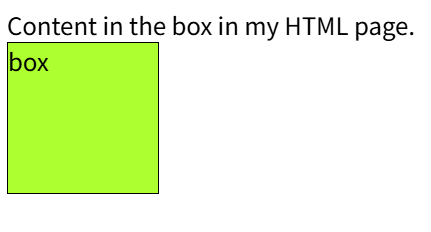
CSS Arrow Please
实现 a custom box with an arrow extending out from the side.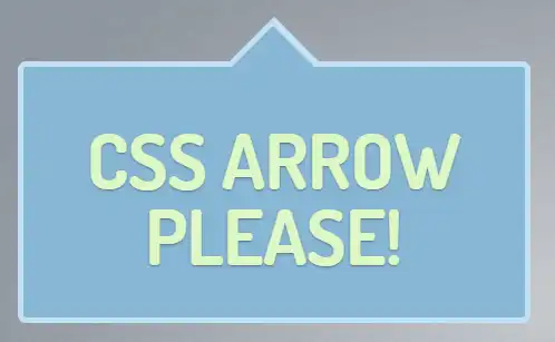
    <div class="arrow_box">
      <h1>CSS ARROW PLEASE</h1>
    </div>
.arrow_box {
position: relative;
background: #88b7d5;
border: 4px solid #f5c2cb;
top: 100px;
}效果: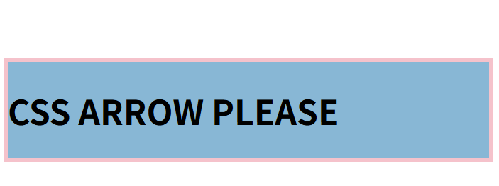
箭头是通过两个三角形实现的:
- 外三角形
- 背景颜色:矩形 border
- 底部和border内边界平齐
- 内三角形
- 背景颜色:矩形 backgroun-color
- 底部和border外边界平齐
添加一个矩形
      .arrow_box::after {
        content: "after";
        border: 10px solid;
        border-color: aquamarine;
        border-bottom-color: black;
      }
效果: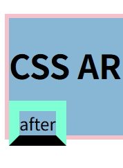
底边是一个梯形,而不是矩形。
如果内容为空:
content: "";效果:
底边的梯形就变成了三角形🔺
现在调整颜色、大小以及位置
      .arrow_box::after {
        content: "";
        border: 30px solid transparent;
        border-bottom-color: black;
        position: absolute;
        bottom: 100%;
        left: 50%;
}| 行号 | 功能 | 说明 |
|---|---|---|
| 3 | 设置border | 背景颜色设置为transparent |
| 4 | 三角形颜色 | 这里设置blakc是为了区分 |
| 5 | 三角形需要相对于div进行定位 | div的position是 relative |
| 6 | 三角形的底部贴着矩形的顶部 |
效果: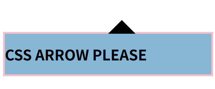
两个问题:
after似乎和div是兄弟,它的ancestor应该是body,定位应该是相对于body,为什么是相对于div?
答:实际上 after 添加的element是在h1的后面,并且div是relative,那么after的 closest positioned ancestor 就是div,所以absolute 是相对div进行定位的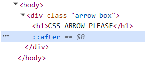
left设置为50%,实际上三角形的位置有点偏右,因为三角形的左边界在div的50%,应该将三角形的中心和div的中心对齐
解决:
margin-left: -30px;效果: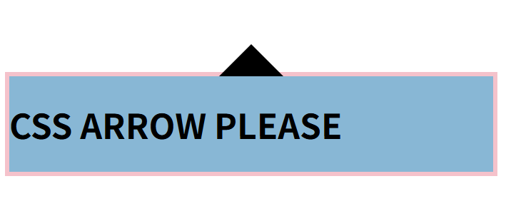
对位了
类似地添加 before,before比after大一点。矩形border的宽度是4,额这个应该不用计算的特别准。
      .arrow_box::before {
        content: "";
        border: 36px solid transparent;
        border-bottom-color: #f5c2cb;
        position: absolute;
        bottom: 100%;
        left: 50%;
        margin-left: -36px;
      }
效果: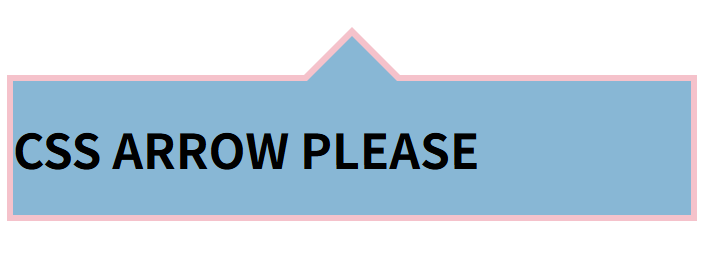
整合下代码:
      .arrow_box::after,
      .arrow_box::before {
        content: "";
        border: solid transparent;
        position: absolute;
        bottom: 100%;
        left: 50%;
      }

      .arrow_box::after {
        border-width: 30px;
        border-bottom-color: #88b7d5;
        margin-left: -30px;
      }
      .arrow_box::before {
        border-width: 36px;
        border-bottom-color: #f5c2cb;
        margin-left: -36px;
      }
Combining pseudo-classes and pseudo-elements
article p:first-child::first-line {}